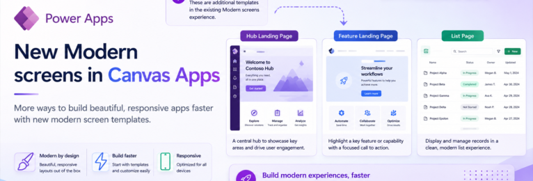
If you recently logged in to your Canvas App builder, you might have noticed that there are a few new screen templates that you can choose from when creating your app. These new screens, which are built with the Modern controls simplify the process of creating new apps, and the layouts are completely responsive.
In this post I will show you the new available screens and the way they look within your app. These new screens include the Hub landing page, Feature landing page and the List page. Also, if you have not previously seen, there are also new designs for the Welcome screen and Header and gallery screens which you can use.
Hub landing page
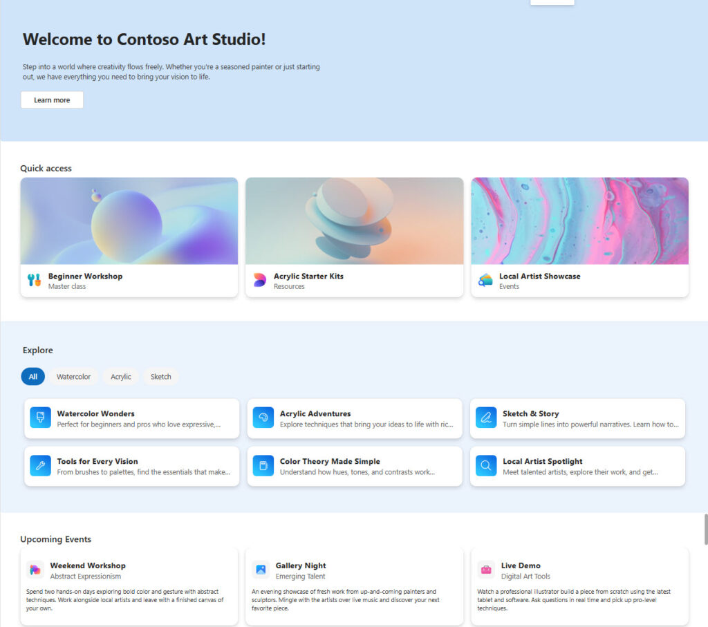
The hub landing page is a responsive page which contains 6 sections, all of the customizable and can be removed as needed.
The Hero section contains a welcome message, description text and a learn more button which can navigate to another screen if needed. The Quick access is just a heading on top of the Quick Card Grid containing 3 Quick cards with images, titles and subtitles. Beneath the Quick Card section, there is an explore section containing filtering tabs and the Explore Card Grid containing 6 Quick cards with titles and subtitles.
Finally the last two sections are the Events Header and Events Grid, similar is design to the Quick access having a header containing a title and a section containing 3 customizable Quick Cards. The image below shows you the look and feel of the Hub landing page.
Feature Landing Page
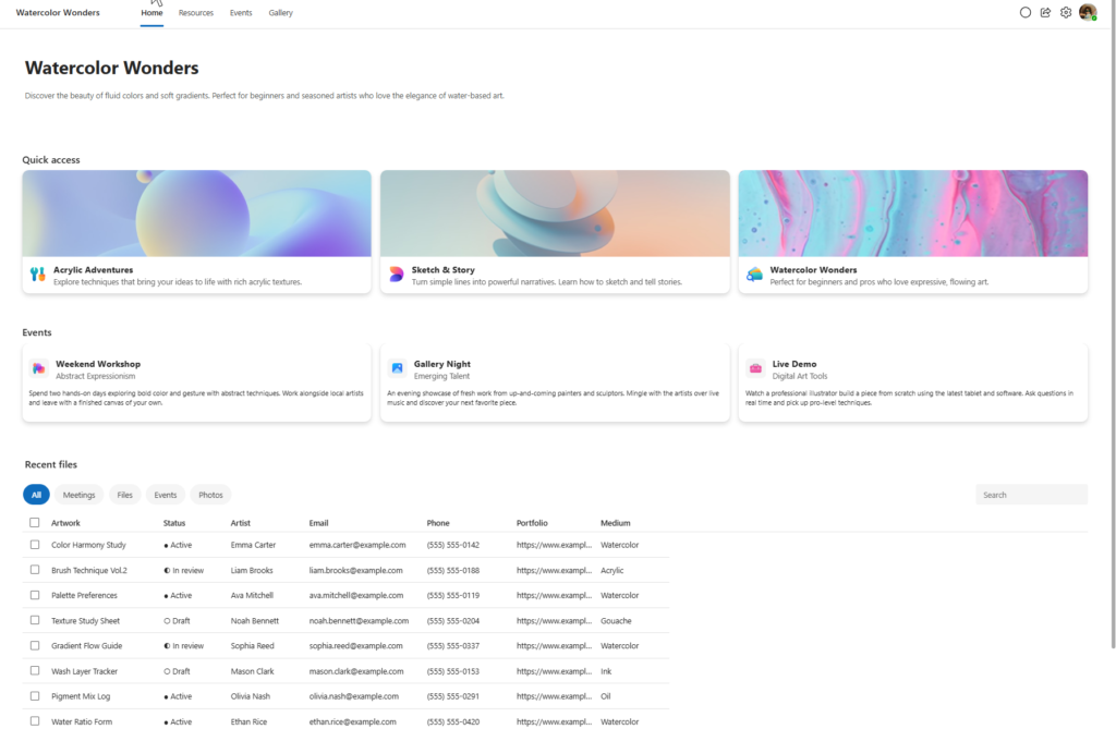
The feature landing page contains some of the same sections as the Hub landing page, but with some differences. On the top of the Feature landing page, we have the banner containing the name of the Feature, tabs with Home, Resources, Events and Gallery links, and on the right hand side we have the buttons for Chat, Share and Settings as well as a Profile icon.
Next, you will have the title and description section, similar to what is on the Hub landing page without the Learn more button, followed by two more sections that appear on the Hub landing page, the Quick access section with the Card grid and the Events section with its own card grid as well.
Finally, you will see the data grid section, titled as Recent files. This section contains a filtering area with multiple bubble filters and on the right side a search control. The Recent files, as well as any other section can be customized and modified to display the relevant data to the application. The image below shows the look of the Feature landing page.
List page
The list page has the same look and feel as the Feature landing page with the exclusion of the Quick access section. It contains the header, Events and data grid (Recent files) sections. The image below shows the List page.
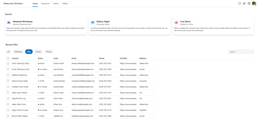
If you have not noticed previously, you will also note that there are two additional screens that have been recently added, but not marked as new. I am not sure when the exact time these were added. These screens are the Welcome Screen, and the Header and Gallery Screen. Their images are shown below.
Welcome Screen
The Welcome screen is composed of 4 sections. The title section with the name of the product/area with the 4 tabs similar to the Feature Landing Page and the buttons on the right for the Chat, Share, Settings and Profile. It contains a Welcome area, a What can you do with 6 cards and a footer with text and a button to navigate to a gallery or another page.
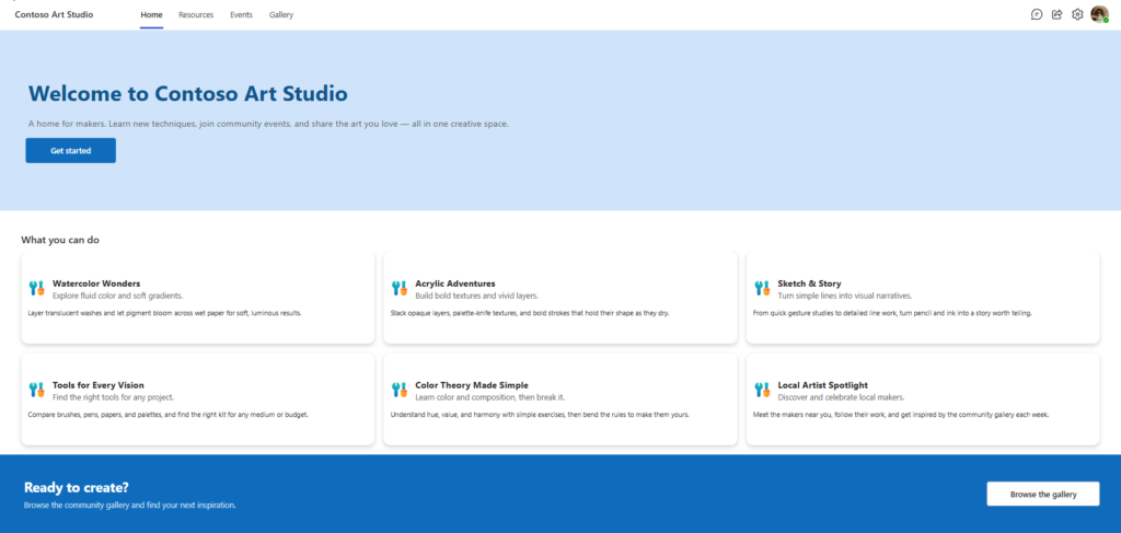
Header and Gallery
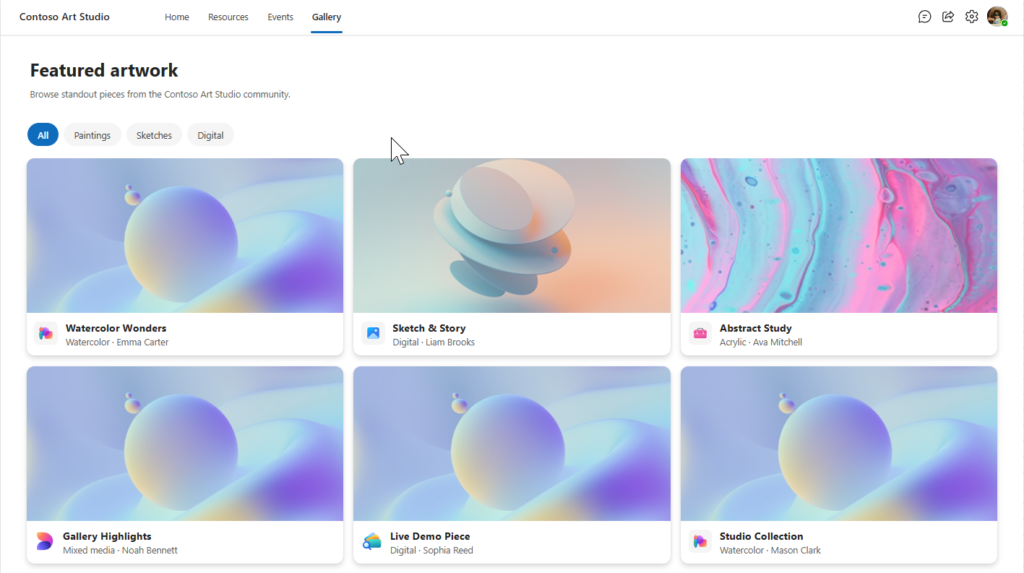
The Header and Gallery contains the same title area with a Feature section with text followed by 6 Quick access cards with the ability to use filtering.