

Late last month, the Microsoft Power Platform Customer Advisory Team (PowerCAT) released the Power Apps Creator Kit, which is a set of prebuilt controls and components to assist both citizen and professional developers in their journey of developing Canvas Apps and Custom Pages. In this post I will review a sample application that I created using some of these components. As there are about 20 components that were released in this kit, I will only be reviewing a subset of these components (both Canvas and Code) and my impression of them.
I created a Transactions App, connected to an Azure SQL backend which shows a list of transactions that are stored in a backend SQL Server (I wanted to make sure these work correctly regardless of the data source and not just using Dataverse). The screenshot below show the Summary Screen of the application, which contains various components. Let’s look at the individual components that make up the Summary Page.
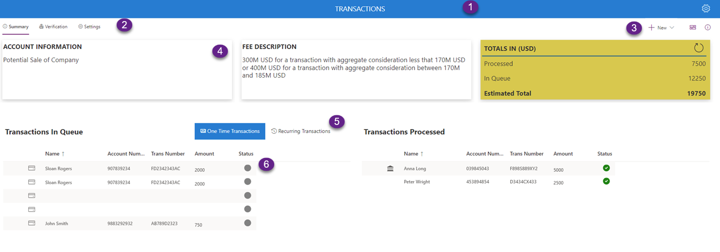
Header Component
The first component, which is a Library Component called Header, provides the ability to add a header to the screen with individual settings, including a left logo (defaulted to the PowerCAT logo, but can be replaced with a custom logo, by modifying the SVG of the header). You can show a back button instead of the logo for all of the other screens which will allow you to navigate back to the previous page. The right image can be shown or hidden as well and is defaulted to an SVG image of a settings icon.
These properties include Back Button Visible, Left Button Image, Left Button Visible, Right Button Image and Right Button Visible.
In the image below you will see two versions of the header, one showing the header of the Home Page containing the Power Platform logo (SVG replaced) and the other showing the back button

The control also has the properties for OnLeftButtonSelect, OnRightButtonSelect and OnBackSelect, so that you can add your own code when these buttons are clicked.
Fluent Pivot (Code Component)
The Fluent Pivot Code Component provides us with navigation which is similar to the tabs in your Unified Interface application. It can have a list of multiple items, which will show a selector for the selected item. If the width of the control does not show all of the items that are available, it will also show a more items link, which will pop up any additional items that are not shown on the control (similar to the Related in Unified Interface). You can include an icon next to each of the item on the links that will show up in your Pivot component. The image and code below show you how the Pivot code component looks and is configured

Table(
    {ItemKey:"summary",ItemDisplayName:"Summary",ItemIconName:"Info"},
    {ItemKey:"verify",ItemDisplayName:"Verification",ItemIconName:"AllCurrency"},
    {ItemKey:"settings",ItemDisplayName:"Settings",ItemIconName:"Settings"}
)
You can use the OnSelect event of the Fluent Pivot component to determine the functionality when each one of these choices is clicked (such as Navigate to a different screen of perform some other operation (such as display a dialog).
An additional example of the Fluent Pivot is used when you want to hide and show a portion of the screen that you are on based on the selection of the Pivot. In this example, a grid is displayed when the One Time Transactions in selected, and then a different grid is displayed when the Recurring Transactions is selected.

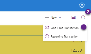
Command Bar (Code Component)
The Command Bar is similar to the Command bar in your Unified Interface. Here you can create a list of Commands that will be executed when the user select an individual item for the Command Bar. The Command bars can be displayed as Text and Icon or Icon Only, they can be displayed as children of Command bar items which will generate drop downs, they can be added as overflow items which means that will only be displayed when the more items or overflow icon is clicked, and they can also be displayed as Far items, which will cause them to be displayed on the far right end side of the command bar. The screenshot and code below show the command bar that contains a drop down along with some far items.

Table(
    {ItemKey:"newItem",ItemDisplayName:"New",ItemIconName:"Add"},
    {ItemKey:"onetime",ItemDisplayName:"One Time Transaction",ItemIconName:"Money",ItemParentKey:"newItem"},
    {ItemKey:"recurring",ItemDisplayName:"Recurring Transaction",ItemIconName:"History",ItemParentKey:"newItem"},

    // Far Items
    {ItemKey:"tile",ItemDisplayName:"Grid view",ItemIconName:"Tiles",ItemIconOnly:true,ItemFarItem:true},
    {ItemKey:"info",ItemDisplayName:"Info",ItemIconName:"Info",ItemIconOnly:true,ItemFarItem:true}
)
The example above does not show individual command items and overflow items, but those are available from the Creator Kit Reference App. The difference between a Command Bar item and a Dropdown Command Bar item, is the that Command Bar items do not have child items with the ItemParentKey property set. Overflow items are regular Command Bar Items with the ItemOverflow property set to true.
In the Command Bar sample shown in the screenshot, I use the drop down for New and the Far Item for Info to popup a Panel and a Dialog, which I will review later on.
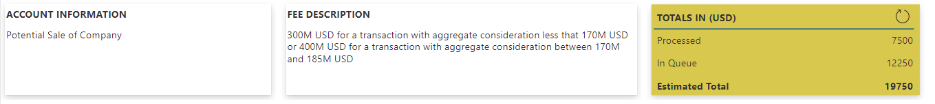
Fluent Elevation (Code Component)_
The Fluent Elevation component provides us the ability to display areas on your Canvas or Custom Page as Elevated areas with different options for depths and mouse over so that it is displayed in a way that it is emphasized on the form. There are 4 available options for depth (Depth 4, Depth 8, Depth 16 and Depth 64), which provide different purpose for their usage, for use with Cards and Grid item thumbnails to Panels and Dialogs. The Elevation component can also be configured for a fill color for providing a customized feel.
In addition both the Depth and the Fill Color have a Hover depth and a Hover fill color properties to provide a customized experience of how the elevation component will behave when mouse if hovered on top of it. The image below shows the Elevation components that are used in this sample app.
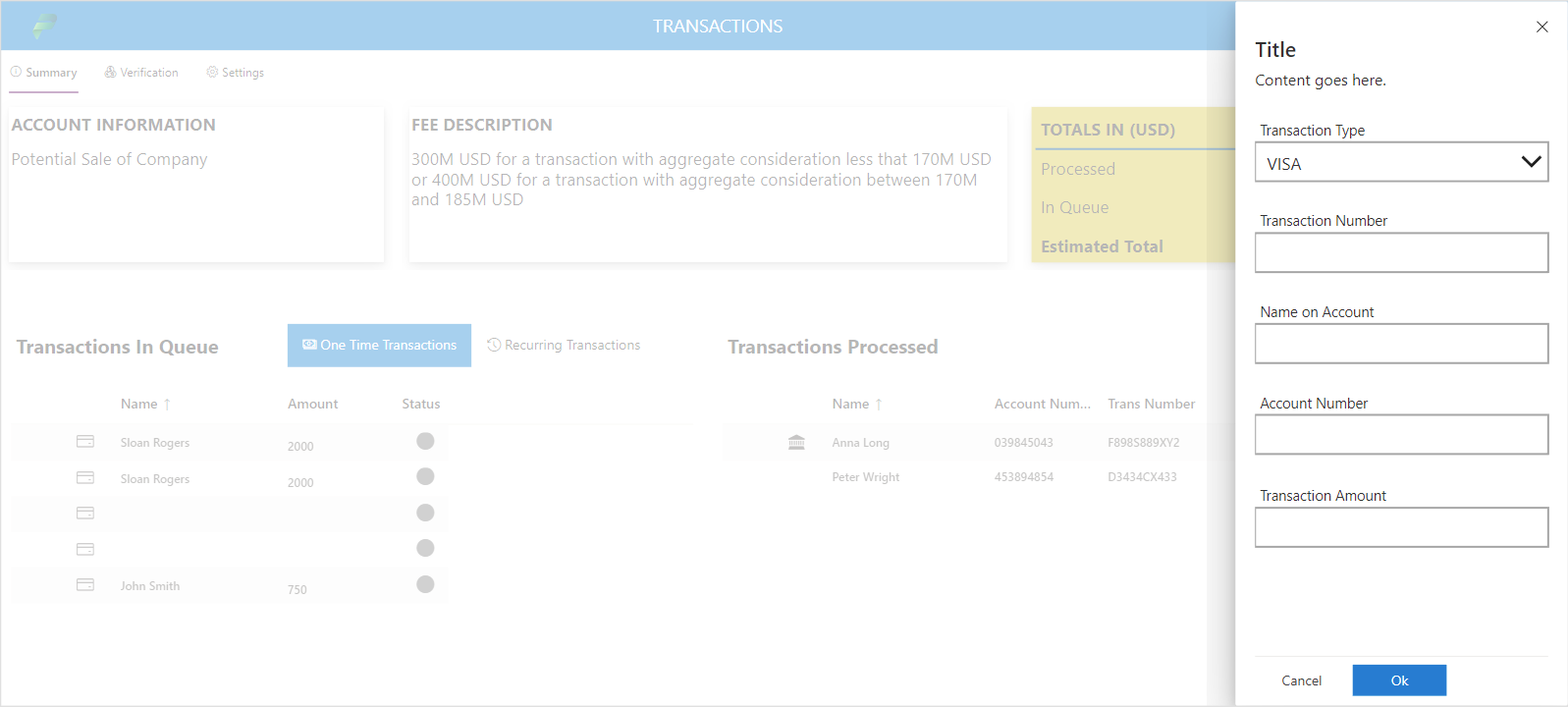
Panel and Dialog
The Panel and Dialog library components provide us with functionality that is similar to Quick Create Pane and the Dialog Box that are part of the Unified Interface. Both of these components provide the ability to open a pane and add a title and content text to it. As these are library components, they can be edited in your existing app to include some additional functionality as I will show in the below example. In the Command Bar that I showed previously, I have the one Time Transaction option that will display the Panel, and the Info command bar button that will pop up a dialog (shown below).
Let’s start and take a look at the Panel. In my particular case, instead of using the Panel as it is available out of the box, I created a Canvas Component out of the Panel Library component by clicking on the Edit component and creating a copy of it. The main reason was that I wanted more than just a title and text for the component, but customize it for my particular use case, which was the creation of a new record similar to the Quick Create functionality in Unified Interface.
The screenshot below shows what pops up when the One Time Transaction command button is clicked. The Panel is added to the screen and the visibility of the Panel is set by using a ContextVariable on the Visible Property called showHidePanel (You can use any name). The panel is set to not visible again on the OnCloseSelect and the OnButtonSelect events by using the UpdateContext and setting the showHidePanel to false. On the button select event I add logic to Save the record by retrieving the data that was added to the Panel and Patching the Transaction table in the SQL Database, and then refreshing the table where the data is stored.
Patch(
    Transaction,
    Defaults(Transaction),
    {
        TransactionId: GUID(),
        TransactionType: TransactionPanel.TransactionType,
        TransactionNumber: TransactionPanel.TransactionNumber,
        Name: TransactionPanel.NameOnAccount,
        AccountNumber: TransactionPanel.AccountNumber,
        ApprovalStatus: 1,
        TransactionAmount: TransactionPanel.TransactionAmount
    }
);

Notify("Your Transaction Record has been saved");
UpdateContext({ showHidePanel: false });
Refresh(vw_Transactions);
The dialog component is also straightforward. It will follow the same logic as the panel, which means it will have a Visible property which will be set by using a variable such as showHideDialog, and then can use the events OnButtonSelect and OnButtonClose to close the dialog when the X or buttons are clicked. The Dialog contains a title and subtitle properties so that the text can be easily rendered and can be reused by different components from within the same screen by repurposing the title and subtitle. The image below shows and example of the dialog in place.
Expand Menu
The expand menu is a menu that is similar to the main area navigation in the Model Driven Apps. It does not provide the grouping functionality or the ability to have multiple areas, but provides that ability to have multiple items. The screenshot below shows how the Expand menu looks in a collapsed or expanded view
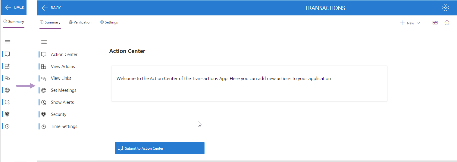
The Width property of the component would be allow to show it in expanded or collapsed mode by checking if the Self.IsExpanded is true or false and setting the correct width.
If(Self.IsExpanded, 200, 46)The Items property of the Expand Menu contains a table the defines the Icon, Label and the Screen to navigate to. Currently the way this component is configured is that this would navigate to a new screen when a selection is made. The code below shows how to populate the items in the Expand Menu.
Table(
{Icon: "ActionCenter", Label: "Action Center", Screen:'Settings Screen'},
{Icon: "AddIn", Label: "View Addins", Screen:'Settings Screen'},
{Icon: "AddLink", Label: "View Links", Screen:'Settings Screen'},
{Icon: "AddOnlineMeeting", Label: "Set Meetings", Screen:'Settings Screen'},
{Icon: "AlertSettings", Label: "Show Alerts", Screen:'Settings Screen'},
{Icon: "ATPLogo", Label: "Security", Screen:'Settings Screen'},
{Icon: "Clock", Label: "Time Settings", Screen:'Settings Screen'}
)
As this is a Library component, it can be edited in the local version of your Canvas app and modified so that you can use your own components to display on the form instead of having to create different screens that follow the same template. The change would be pretty straight forward, and you can output the name of the resource that would have to be shown on the screen.
What’s Next?
There are still more components to review, so there will be some follow up articles to this post. The next post will probably be the Details List, as this contains a lot of functionality by itself, and maybe then a video as well. I am really thankful for the hard work by the PowerCAT team and the contributors from the MVP community that help create this toolkit. There are probably some other Fluent components that I would like to see, but not sure if they are in the roadmap or not. It would be nice to have Code components for all the Fluent UI components from https://developer.microsoft.com/en-us/fluentui#/controls/web.
Looking forward to the rest of the components, especially the DetailsList since I cannot get it to work properly.