

In this post, I will review a recently created Action Button control that provides the ability to display an Action button on the form in multiple variations and bind it to an additional control to enable or disable the control on the form
The control has multiple properties that allow the customization of the control so that it can be displayed in a manner that is best suited for the end user. The table below shows the different properties of the control and explains how to use them
| Property | Data Type | Description |
| buttonAttribute | Single Line of Text (Bound) | This is the property of the control that is bound to an attribute on the form |
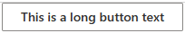
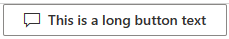
| buttonText | Single Line of Text | This is the text that will be displayed on the control. If the button type is Compound, this will contain the first line of text that is displayed on the compound control. |
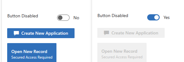
| buttonStatus | Two Options | This is the Status of the control that is bound to a Two Options field, so that the control can be displayed as Enabled or Disabled |
| buttonIcon | Single Line of Text | This is an Icon that will be displayed inside of the Action Button. To get the list of available icons, refer to the following link: https://developer.microsoft.com/en-us/fluentui#/styles/web/icons |
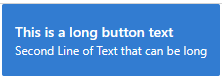
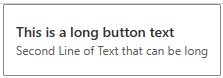
| buttonType | Enumeration | The button Type property is an enumeration of the type of button to be used. You can specify the Default button which is a 1 line button or the Compound button which is a two-line button, displaying the second line in a smaller text |
| buttonStyle | Enumeration | The button Style property is an enumeration of the style of the button to be used. You can specify Standard button or Primary button. The Standard button is the default White/Gray button, while the Primary button is displayed in blue. This of course is based on the Theme as well. |
| secondaryText | Single Line of Text | The secondary text is the second line of text that will be displayed on the button itself. |
The following section shows how some of the buttons might appear on the form:


The source code and the managed solutions for the PCF controls can be found in the github repository below:
PowerPlatform/PCF/ActionButton at master · ariclevin/PowerPlatform (github.com)