

In my last blog post of this year, I decided to write about creating Nested Galleries in Canvas Apps. There are probably various blogs and videos of this already, but I thought of simplifying this, as it seems to be a common request.
Let’s go ahead and start by creating a new tablet-form factor canvas app, and use the blank app template. We can specify the name, icon and screen orientation. In this case, I set it as Landscape orientation and set the size to 16:9 (Default). I also added the header to make it look a little prettier.
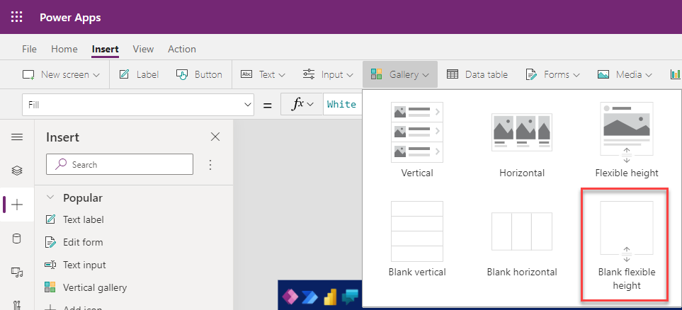
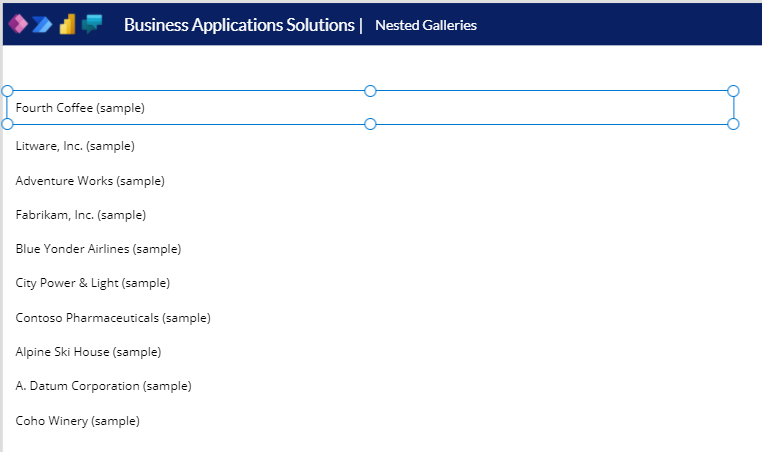
We will be using Accounts and Contacts, that I added via the Import Sample Data wizard in my Dataverse environment. We will start by Inserting the first gallery. This will be used for accounts. This gallery should be scrollable, so the gallery that will be used will be Blank flexible height gallery, which can be inserted from the Insert tab or menu.
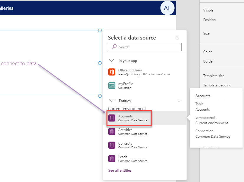
Once we inserted the gallery, we can name it, resize it and place it where we want on the screen. I left some space between the banner and the top of the gallery for adding some icons and labels later. I will now go ahead and connect to my accounts data, by clicking on the connect to data link inside the gallery.
This will pop up a dialog with available data sources. Expand the entities area, and select Accounts from the list of entities as shown in the image below.
You will now notice on the properties panel that the Data Source property has been set to accounts, as well as in the Items property in the function bar.
Let’s go ahead and click on the tree view to add a few labels that will display the different columns of this table. To add the first item, we can click on the Add an item from the insert menu inside our gallery, or insert from the Insert tree. Let’s select a text label. It will default to the Account Name column in our accounts table.
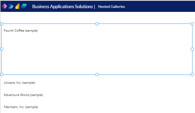
Before we add a few more columns, click on the area surrounding the Account Name column that we added as shown in the image below.
We might want to reconfigure the Template size of the gallery, so that the spacing is not too large. I will change the template size to 50, and change the height and top properties of the label accordingly so that it looks a little cleaner.
We can now add a few more columns, either by copied the first column that we added, or adding a few more text labels from the Insert menu. The image below shows the completed gallery.
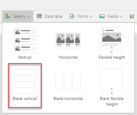
Now that we are done with the Parent gallery, we can go ahead and create the child gallery, in our case the Contacts gallery. Before we insert the Contacts gallery, let’s expand the Template size of the parent gallery to 100. This will allow us to maneuver in the child gallery. While having the first row of the gallery selected, click on the Gallery icon on the Insert tab, and select Blank Vertical as shown in the image below.
Similar to the previous gallery, let’s go ahead and connect to a data source and insert a few items to the gallery. Click on the connect to data, expand entities, and select the Contacts entity. Then click on the Add an item for the insert pane and select a text label. We can expand the Full Name label a little and move it down and remove the scrollbar, but we would still see a little bit of a mess (shown below).
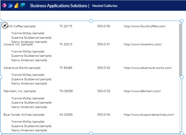
This doesn’t look appropriate as it is showing all the contacts under each account. Let’s first fix that so that we can continue customizing the gallery. We can do this by adding a filter to the Items property as such:
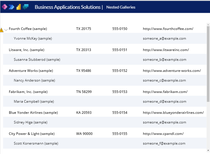
Filter(ThisItem.Contacts, statecode = ‘Status (Contacts)’.Active)
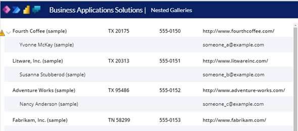
After adding the line above, I added the email address field to the Contacts, and the result is that I can see all the results of the parent and child galleries, as shown below.
Now, the next thing is that I don’t want to show all the items expanded all the time, but expanded or collapsed based on a click on an expand/collapse icon. I will add two icons to my accounts gallery (a Chevron Right and a Chevron Down). The Chevron down will show when the child gallery is expanded, and the Chevron right will show when it is collapsed.
I will set the visible properties for the icons as follows:
- Chevron Down Visible Property: ThisItem.IsSelected
- Chevron Right Visible Property: !ThisItem.IsSelected // Notice the ! before the ThisItem
We should now place them on top of each other.
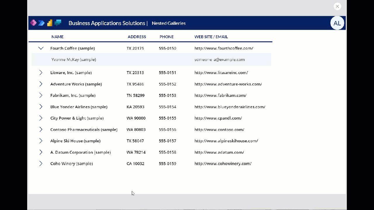
Finally, we will select the Contacts child gallery, and will set the Visible property to ThisItem.IsSelected.
This will collapse all of the items with the exception of the selected one. We can change the selected item to see the items that are available under it. The animated gif below shows the final result.
I hope this post below was helpful for anyone who is beginning creating Canvas Apps. I will follow up on this post with a few extras including how to Expand All Collapse All Sorting and Additional Types of filtering. Wishing everyone in the community a Happy New Year.