

In the last few days, Microsoft made some big announcements related to new features that are not available in public preview. These are the Public Preview of Custom Pages for converging mode-driven apps and canvas apps as well as the command designer for model-driven apps with Power FX (which is still in preview).
You can read about these two announcements in the Microsoft Power Apps blogs or by clicking on the links below:
https://powerapps.microsoft.com/en-us/blog/announcing-command-designer-with-power-fx-preview/
Now, let’s go ahead and review each one of these separately.
Custom Pages:
Let’s start with Custom pages. Custom pages can be used within our model-driven apps anywhere where all pages are supported. This means the main area of the application, dialogs or the new app side pane. It allows the ability to have functionality that is not achievable using the standard features of model-driven apps, but can be achieved using canvas apps.
Custom pages can be opened from the site map for ease of access or from existing model-driven app logic using the Client Api. Custom pages can also open other custom pages or model-driven app pages. They give us the ability to author pages that are too complex to achieve within the existing model pages.
When we create a new app we can now easily add custom pages and take advantage of Canvas Authoring.
There are a few ways to start with custom pages, but let’s go ahead and start by creating a new app.
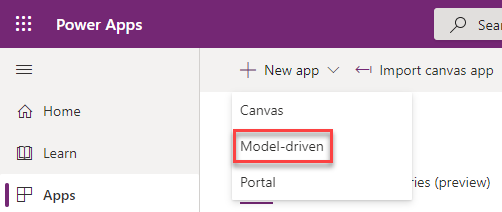
First thing, let’s navigate to the maker portal, so that we can start creating the new app. As of the time of writing this blog post, we would need to access this by going to the preview maker portal at https://make.preview.powerapps.com.
To start creating the new app, click on the “+ New app” command bar button and select Model-driven from the drop down menu.
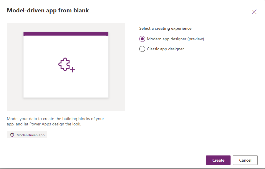
This will pop up the create model driven app from blank window, where we can select to use the Modern app designer (preview) or the Classic app designer. To start with the Modern app designer, select that choice, and click Create.
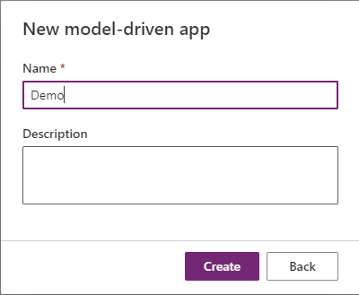
Next we will need to give the app a name, and an optional description, and click on the Create button.
After a few seconds the new app will be created, and we can start adding pages. There are three different types of pages that can be created, these are table based view and form, dashboard and custom (which is currently in preview). The animated image below shows you the three options.
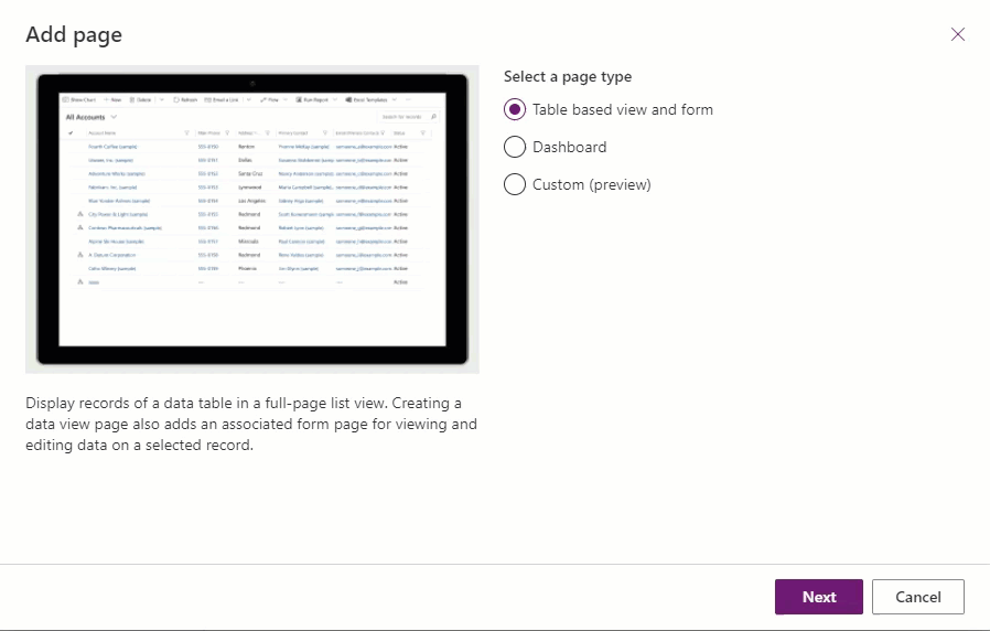
We will start by selecting the table type, once selected you will have the option to select the appropriate table or tables that you want to add to your app, and with an option to add these pages to your site map as well.
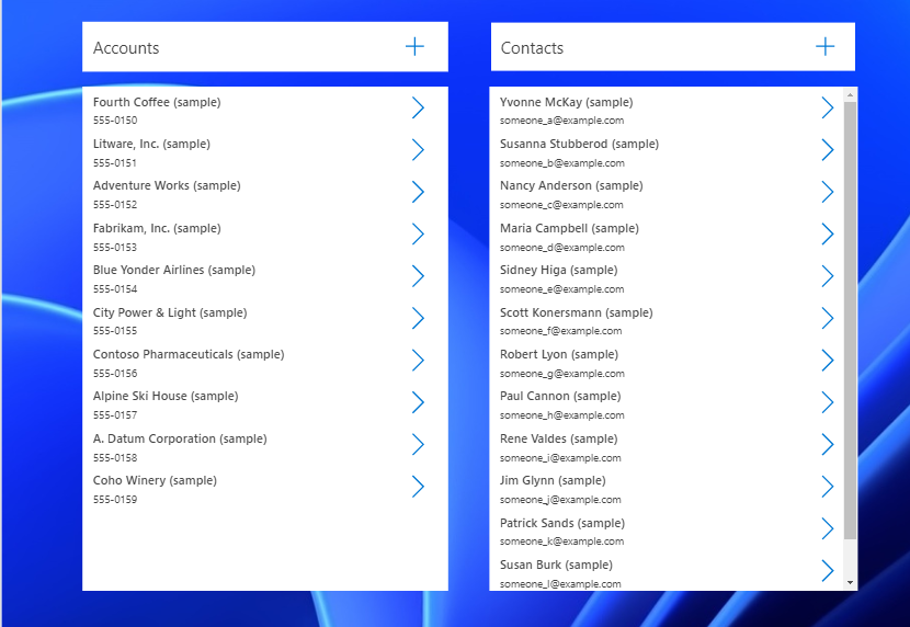
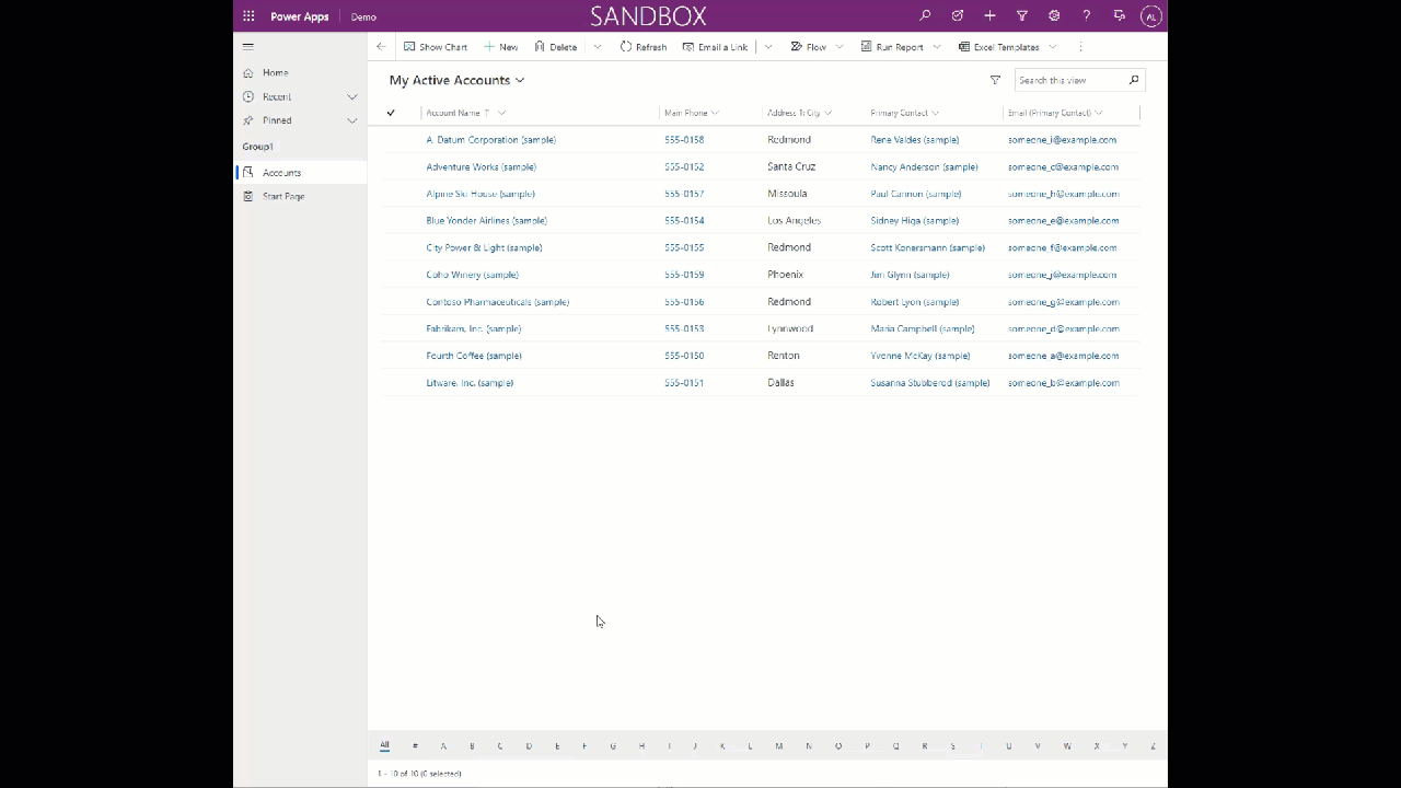
When you click on the add button, you will be able to see a preview of your app directly from the designer window, basically a preview of what you app would look like. The image below shows you the preview window. You will notice that the center area is the preview, and on the left hand side we see the tables that were added to the app.
The preview area, not only shows you the way the app looks, but allows you to change the layout so that you see how the app will look in responsive design for different devices.
You will also notice the section to the left that is expanded to show the data tables, which contains links to the pages and navigation. This first link shows you the tables, dashboards and custom pages that make up your app, while the second link shows you the site map. These were covered in additional detail in a previous blog post.
Let’s go ahead and add a custom page. Under the pages left hand navigation area (or from the command bar), click on Add page, and select the Custom (preview) option. Once selected you will have the option to create a new custom page or use an existing custom page that was previously created. In our case, since we don’t have an existing custom page, we will Create a new custom page and give it a name.
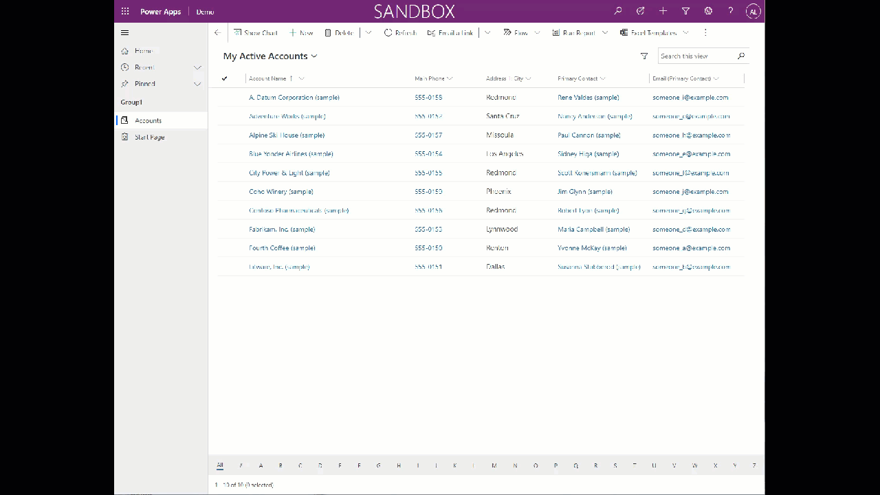
Once we enter a name, this will open a new designer, and we can start working on the new app. I have added to the app a couple of galleries and commands so that we can see how this looks and works in our model-driven app. The image below shows the app that we created. Once you are satisfied with the app, click on the Save button and then publish it.
Close the custom page, and then go ahead and Save and Publish the Model-driven app that you created. The animated image below shows the end result of the custom page inside the model-driven app.
To learn how to navigate between your Canvas app and the model-driven app, you can read more about it in the following Microsoft Docs page : https://docs.microsoft.com/en-us/powerapps/maker/model-driven-apps/page-powerfx-in-model-app
Custom pages can also be available by calling them from JavaScript within the Model Driven App by using the Xrm.Navigation.navigateTo function and providing a page type “custom”, and providing the name of the custom page (canvas app). You can then open the custom page inline or as a centered dialog. The following Microsoft Docs page includes samples on how to open this page: https://docs.microsoft.com/en-us/powerapps/developer/model-driven-apps/clientapi/navigate-to-custom-page-examples
Command Bars using Power FX:
Next, we will take a look at using Command Bars. We will use the same app that we already created, and add a command bar button that will use Power FX to show/hide the button as well as a custom function that will execute on the click of the button.
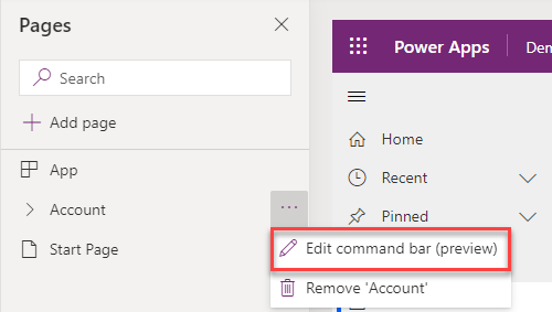
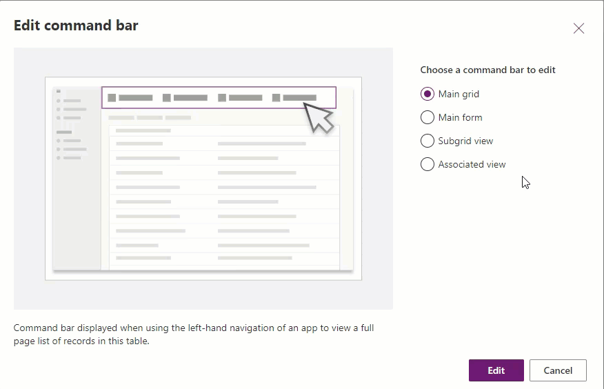
In order to start using the new Command functionality, we first need navigate to the page (table in this case) that we want to work with, and select the Edit command bar (preview) option by clicking on the more options to the right of the table name and selecting that option as shown in the image below. This has to be achieved from the Pages navigation pane.
This will pop up a dialog where we have to select what command bar we would like to customize. There are four available options to select which include the Main grid, Main form, Subgrid view and Associated view. The image below shows these options.
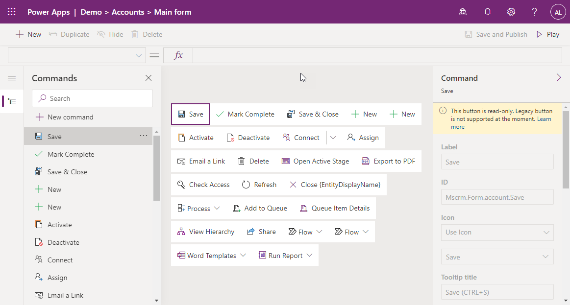
Let’s go ahead and select Main form. When the Commands page open, we will see a view that contains all of the existing command bar buttons that are available for the table within the Main form. At this point in time (as this is still in preview, and we don’t know the exact timeline of release), modifying the existing buttons is not currently supported, so any customizations that is needed for this, will have to be done using Ribbon Workbench. The image below shows you the Main form Command Bar before we have added any additional buttons.
Now let’s go ahead and create a new command. We will create a simple command that is called Calculate Credit Limit which when clicked will multiple the number of employees in the company by 10,000, and will set it to only be visible when the number of employees contains data.
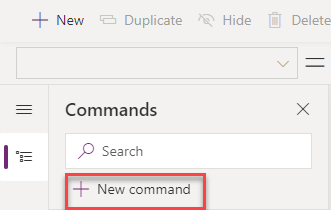
To start creating a new command, we click on the new Command button on the top of the left navigation pane.
Once we click on the new command button, we will see that a has been created. We can move the command (using drag and drop) within the Main form to place it in the appropriate location, however this can only be done for new commands, and not the existing ones. Let’s provide the new command some of the properties, such as the Label, Icon to use and the Tooltip text.
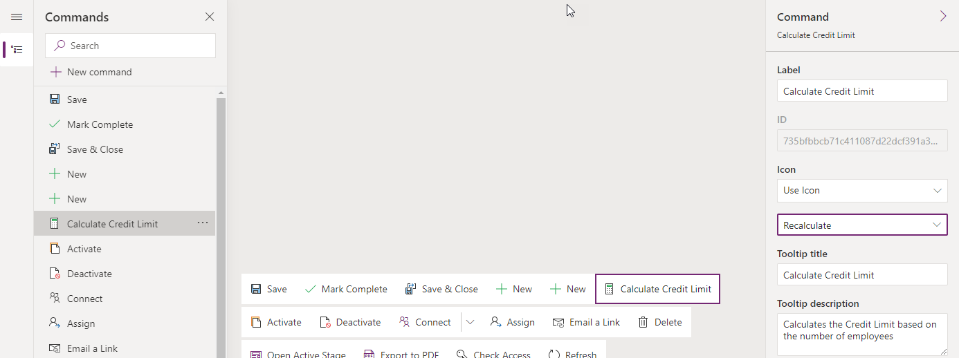
Next, we would like to set the functions for the Action that will be performed when the button is clicked as well as the Visibility of the button. On the right Command Pane, the last two options are Action and Visibility. The Action selection has two options: Run formula and Run JavaScript.
If we use the Run JavaScript option we can provide the name of the library and the name of the function to call when the button is clicked. This is more of a legacy type of action which might be used in the future for enabling the legacy buttons. The Run formula allows us to Run Power FX code when the command is clicked.
We can use the Patch function together with the Self.Selected.Item together in order to update the Credit Limit, and then compare the Number of Employees to Blank to control the visibility of the button. I am still working a few glitches as to what is working and what is not when it comes to Power FX for commanding, but the code below is working properly.
On Select:
Set(TotalCredit, Self.Selected.Item.’Number of Employees’ * 10000);
Patch(Accounts, Self.Selected.Item, {‘Credit Limit’: TotalCredit});
Visible:
Self.Selected.Item.’Number of Employees’ <> Blank()
The following Microsoft Docs page provides some samples on using Power Fx for commands in the Model driven apps: https://docs.microsoft.com/en-us/powerapps/maker/model-driven-apps/commanding-use-powerfx
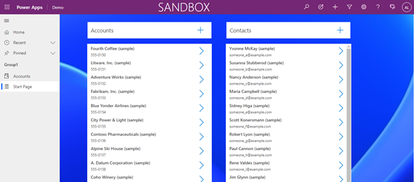
Now, let’s look at the end result after adding the button and publishing the app commands.
I hope that this blog post/article provided you with some insights as to what is coming in the new future.