

As part of the 2019 October Release (Wave 2), Microsoft is introducing PowerApps Canvas App Components. Canvas App Components are reusable components that can be shared across multiple screens of your app, without the need to create or copy the component across the multiple screens. Create once, and use multiple times. Canvas App components can also be imported and exported, so that they can be used across multiple applications. This post will demonstrate how to create a simple component, add custom properties and use it from within your Canvas application
At the time of writing this post, Canvas App Components are in Preview, and must be enable via the App Settings. In order to enable Components, Navigate to File -> App Settings and select Advanced Settings from there. In Advanced Settings, under Experimental Features, change the slider under Components from Off to On. Once this is done, go back to your application, and you will see that Components are now available under the Tree View and in the Insert menu.
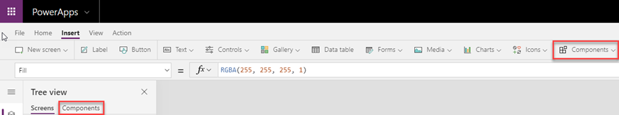
To Start creating your Canvas App Component, click on the Components menu in the Insert Tab and Select New Component. You can also import a component from that menu. Alternatively in the Tree View, if you click Components Tab, you can choose New Component as well. Once you click on the New Component link, it will open up a new Screen where you can develop your Component. For this sample, we will create a Screen header containing custom text, and two icons, one which will contain a link to navigate to a different Screen.
Add a Textbox and set a background color for it, a Home icon and a User icon as shown in the below image.

The next thing that we need it to set the Text and the link for the Home page to be Dynamic, so that it can be set from any screen where the component was added to.
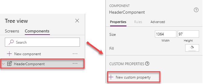
In the Tree View, under components, click on the name of the new component (in this case called HeaderComponent). In the Component Details on the right hand side, click on New custom property, under the CUSTOM PROPERTIES section.
When you click on the New custom property, the New custom property panel will show up. Here we specify a Display Name, Name and Description for the new property. We also need to select whether the property is an Input or Output property. Input properties receive data from the app, whereas Output properties send data back to the app. In our case lets enter the following as in the screenshot below. As this is a Label/Textbox, we will set the Data Type as Text.
Available Date Types include: Text, Number, Boolean, Date and Time, Screen, Record, Table, image, Video/Audio, Color and Currency. The image below shows you how to add those Custom properties.
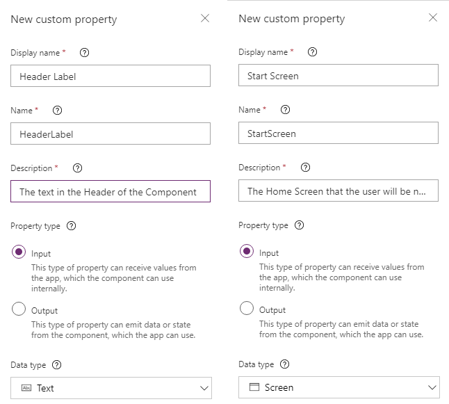
NOTE: The names that I used for the application where this is used are Header Text and Home Screen. If you follow the directions, please replace the Display name and Name fields to match the table below.
| Header Text Property | Home Screen Property | |
|---|---|---|
| Display Name | Header Text | Home Screen |
| Name | HeaderText | HomeScreen |
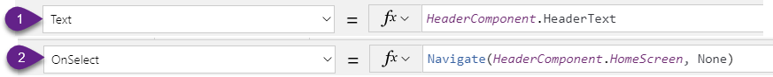
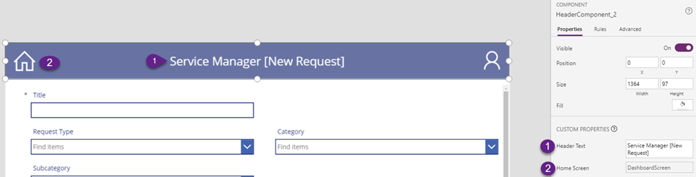
Click on the Textbox Control within the Component. Select the Text Property, and in the function enter HeaderComponent.HeaderText – (1). This is the name of your component, followed by the name of the custom property. This will show the proper label for each screen in the header of the Component. Do the same for the Home Screen icon. Select the OnSelect Property/Action, and in the function enter Navigate(HeaderComponent.HomeScreen, ScreenTransition.None) – (2). This will make sure that clicking on the Home button will navigate to the proper screen.
At this point, the component is done, and you can use it within your Canvas App. Of course you can extend it as much as you need.
Click on the Screens navigation in your Tree view. On the Insert Menu, under Components, you will now see one additional menu item on top named HeaderComponent. This is the name of the component you just created. Select it, and place it on the top of your screen. When you click on the Component within your app, your will see in the properties window on the right the Custom Properties. Enter the Header Text and Home Screen properties.
That’s basically it. You can now add the component to every screen of your application, without having to write additional custom logic. This was a simple component, but you can extend it to perform most of the functions that you need.
For the full information of creation of components in Canvas Apps, visit the Microsoft Docs website.